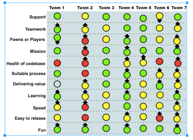
Who is that ^ for?
From our friends at spotify:
When visualizing the health of an organization, there are two key audiences:
1) The teams themselves.
While discussing the different indicators, the team builds up self-awareness about what’s working and what’s not. A broad selection of questions helps expand their perspective. Perhaps they were well aware of the quality issues, but hadn’t really thought about the customer value perspective, or how fast they learn. It also provides a balanced perspective, showing the good stuff as well as the pain points.
2) People supporting the teams.
Managers and coaches get a high level summary of what’s working and what’s not. They can also see patterns across multiple teams. A visual summary like the above helps managers and coaches to figure out how to spend their time, and who to talk to about what.
The first step in taking on any problem is to be aware of it. And this type of visualization makes that possible.
Time to read up on TPS / Taiichi Ohno… the idea that “Red is Good” has roots there, iirc.


 Green = Awesome. Doesn’t necessarily mean things are perfect. Just no need for improvement right now.
 Yellow = There are some important problems that need addressing, but it’s not a disaster.
 Red = Things are really crappy and need to be improved.
 ︎ Things are getting better over time
 ︎ Things are getting worse over time